I analyse human vital signs data for a job, so I'm always interested in graphs (usually of vital signs).
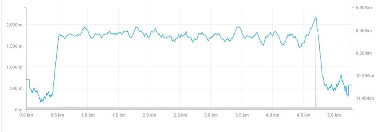
This is the Strava graph of my Week 9 Run 2 run, round the perimeter of Farmoor reservoir.
What I find quite fascinating is the series of ripples, all roughly the same period where the pace varied up and down.
When I first posted about w9r2 I said I thought the body "knew" what was the appropriate pace for it, and that it seemed to be getting faster.
What it looks like here is self regulation - quite unconsciously I was speeding up and slowing down over a period of about a minute, while the average speed was roughly constant. Little bursts of fast running were compensated for by slightly slower times of recovery. The big spike at the end was because I consciously accelerated for the last minute! (Not exactly a Mo Farah sprint finish, but the same idea!)
A colleague of mine who used to run a lot says that the fittest runners show an absolutely flat graph - as if their legs were like a metronome.
For an excessively nerdy final comment - there is a mathematical term for the variations of pace; they are called "limit cycles", and can occur in feedback systems. I think this is what might be happening - when the body can't get enough oxygen to sustain the pace, it compensates by slowing down a bit. I wasn't consciously aware of doing this!

")