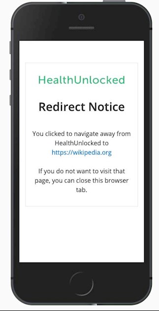
Some of you may have noticed the above appearing when you select a link (URL). Below, Laura from HealthUnlocked explains why this security feature has been introduced - it gives you an opportunity to check the link you selected is taking you where you expect. This new security feature also means that we can more confidently use URL shortening services, like tinyURL and bit.ly, which we sometimes need to use when HealthUnlocked won't properly establish a link to a web reference using lots of punctuation characters.
Neil
Good morning everyone,
As you will know by now, we are always exploring ways to try to improve security and awareness of online safety on HealthUnlocked.
Another step towards doing this is to introduce a redirect notice page. You may well have seen a page similar while navigating around other websites. There are many purposes for this notice, here are a few below in relation to HealthUnlocked:
- It reduces the risk of vulnerabilities, e.g. others sharing URL's that mimic those that are trusted but actually redirect to a different site (potentially with malicious intentions). This is unlikely but it's still a risk we want to reduce nonetheless.
- We currently hyperlink any links shared in posts and replies which means the full URL link isn’t always visible. This notice will provide another chance to check the link you will be taken to so you are confident it’s a link you want to visit.
- It acts as a deterrent for anyone wanting to share suspicious/spam links in posts.
