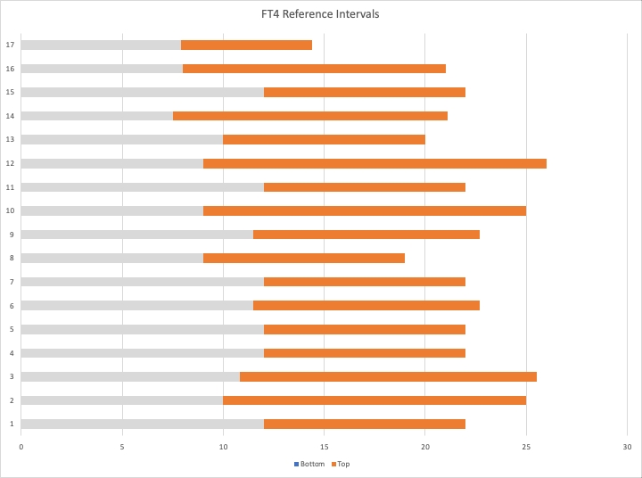
I created a small Excel chart the other day.
The orange lines represent the reference intervals for Free T4 tests in 17 different UK NHS Labs. (The grey is just the part between zero and bottom of reference interval.)
This is only intended to illustrate how varied they are. The orange in the top one only has a small overlap with several others, for example.