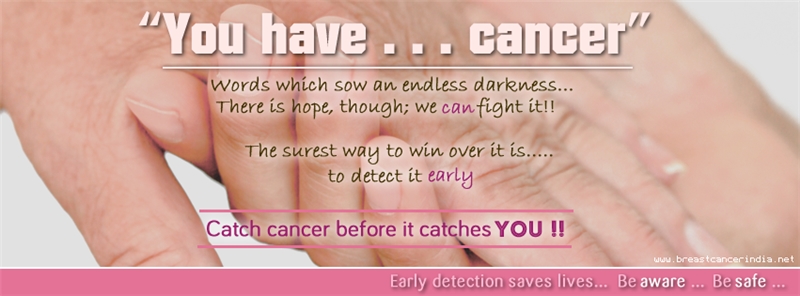
Today, I finally found some time and updated the index page of our website (breastcancerindia.net
You see, I do not know much of web designing, and just dabble around a bit here and a bit there. So I will be very happy to receive your feedback on where can we improve the site more.
When you have time, could you just see the index page and comment on any of the following:
1. Aesthetic appeal - Does it look nice or is it too harsh to the eyes
2. Selection of fonts, size and line distance (you can ignore this, if you do not know much about fonts)
3. Any change of colour suggested
4. Are there too many images, or it looks fine
5. Is it user friendly? - Is it too difficult to move around?
6. Is the message clear?
I have updated only the index page. So just see the index page. Don't bother about other links. Also, to be honest, since I am not a professional at designing, I can just about expect the page to be average, nothing more. But as long as people find it easy to use and look around, it does not matter
Feel free to tell. Even if you feel something or some design is looking bad, please do tell me. I appreciate criticisms. They help me grow.
BTW, there is something wrong with posting a post here at HU. I cant remove that 'awareness' image above. Anyways, ignore the Awareness image
Thanks a lot
Sumeet