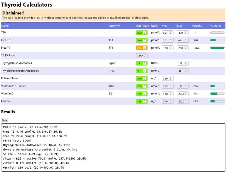
I'm a thyroid patient but also a computer programmer by profession. I have created a website with blood-marker calculators, as you can see below. You can find it by browsing to: thyroid.chingkerrs.online/.
I've written it with us thyroid patients in mind with a few bells-and-whistles (more to come): -
* Formats the results so they can be copied into posts on this site. Just press the "Copy" button!
* Has more blood markers. It is very easy for me to add other blood markers.
* Works well on smaller screens like phones
I wanted to do a little something to repay the excellent advice that members here have given me time-and-time again over the years.
I know that FancyPants54 's husband has kindly written a different one (thyroid.dopiaza.org/ ), but as I am a fellow patient perhaps I have more "skin in the game" and can enhance mine more quickly?
I would love to hear your suggestions for improvements and fixes (large and small). At the moment I'm able to make improvements rapidly. Some ideas are: -
1. Easily set the ranges from different labs, e.g. Medichecks, Blue Horizons. I would need someone to tell me the ranges for the different labs.
2. Switch from SI to US ranges.
3. Convert test results and ranges from SI to/from US.
I have other bigger ideas but I'd like to hear any feedback.
Thank you!
Written by
Decant
To view profiles and participate in discussions please or .
Yeah, I think there could be too many, hopefully you all can help find the sweet-spot. I might have a way of hiding different sections of bloods; group into say Thyroid, Vitamins, Hormones, Automimmunity, etc. That way you could just show what you want?
Could be a nice feature. Also if there was a way to compare a previous set of results to current results? Would it be possible to download it so it can be individualised? Might be complicated but IDK whats possible. 😆
That's also something I'd like to do. Quite a bit of work! At home I have a spreadsheet with my results going back in time. A column per test date. Then it would need a graph, and so it goes on 😃. Leave it with me!
The issue I have is that ranges change by lab, and also over the years (occasionally). So the ranges need to be per test date, but then it might get too messy and confusing to use!
I would prefer to see a T4:T3 ratio as that is what is mentioned here more than T3:T4, for example we frequently see mentioned that good conversion takes place when the ratio of T4:T3 is 4:1 or less.
No, you've given the T3:T4 ratio and many of us would prefer to see the T4:T3 ratio which is more often used here.
To clarify:
FT4: 22.6 (12-22)
FT3: 4.46 (3.1-6.8)
T4:T3 ratio is when you divide the FT4 by the FT3 = 5.067 : 1 and we usually talk about this ratio and say good conversion takes place when ratio is less than 4:1 (as originally mentioned by Diogenes).
You have given the T3:T4 ratio by dividing the FT3 by FT4 which gives 0.20 and very few of us know what would be poor conversion using this ratio, I certainly don't.
If you want to keep the T3:T4 ratio can you add the T4:T3 ratio as well?
Thanks. That could get complex/overwhelming quite quickly, especially as ranges seem to change occasionally. I wonder if users should be able to select by laboratory, but then they wouldn't know without looking at the report carefully.
Maybe the drop-down selector should list (e.g.): -
* Medichecks (Lab: Eurofins County Pathology)
* Medichecks (Lab: The Doctors Laboratory)
* Medichecks (Lab: INVUI)
* Other choices for the other testing companies and labs like Blue Horizons
As you can see that could get complicated for patients to use!
Yes, too many choices and will complicate things but, assuming yours works the same as the dopiaza one, then to keep it simple any one of the calculators can be used for any of the tests, eg I have used all of the dopiaza ones to work out any of my other tests such as the TSH one to work out percentage through range of ferritin.
Yes indeed it does; the calculation is the same for all blood-markers.
percentage = ((result - min) / (max - min)) * 100
In due course I'd like to add a converter, to allow conversion between SI units we use and the US units. An earlier version had this in the table but it was too cluttered and not useful in the everyday case.
I'm starting to think that I should allow the user to hide the min and max, and/or re-order the columns to show name, acronym, min, max, test-result, units, percentage in that order.
Thank you. For someone like me who struggles with Maths...childhood phobia, never lost :-)...this would be most helpful for me. I am a visual person...and here you've created a visual image of mathematical results. Brilliant. Thank you very very much.
Comments very much trying to be helpful - not critical!
I think the ability to copy (also present in FancyPants54 's husband's one) is good. Somehow members still seem to want to post as images!
If you wanted to space out the results more, you could use em space or en space characters. Unlike normal spaces, they don't get reduced to a single character when displayed!
The up/down clickers on the result and range values don't need to allow negatives! They could stop at zero.
For those who get results from the same lab repeatedly, it might be helpful if the ranges could be saved in a cookie?
All comments welcome; I'd like it to be useful and accessible to all of us here!
I'm happy to work on the format of the results; I've based it upon what I've seen here; trying to standardise it so everyones looks the same - save some effort from you admins
I can format the data using   into columns on the webpage, but I don't think it's what we want, when it's pasted into HealthUnlocked the font is not monospaced so the various columns wouldn't line up anyway.
I've added a hard zero limit on the up/down spinner. Uploaded.
I do want to do something about saving ranges. I shall save them to local storage in the browser; this entire page is run client-side, there's no server to set a cookie. Saving client-side means there's no privacy risk (and is easy!) but does mean the same ranges aren't available between browsers or between a laptop and phone, for example. Horses-for-courses.
Where are you suggesting white text on orange? The input already does that when it is outside the range. Orange is for warning, better than red as being outside the range doesn't definitely imply "run to the hospital"!
Sorry - I missed what you said about white on orange!
Yes, the fact it changes when out of range is great. But I find it relatively difficult to read that combination on a small screen, or without putting glasses on, etc!
QR Code for this calculator - click on the (+) and point your smart phone or tablet camera at the QR code. On many devices that will make it easy to get to the calculator.
Something I would like to see is a Reset button, that would return all the fields to what one would see on first opening the page. I would be very happy if you could do this!
Content on HealthUnlocked does not replace the relationship between you and doctors or other healthcare professionals nor the advice you receive from them.
Never delay seeking advice or dialling emergency services because of something that you have read on HealthUnlocked.