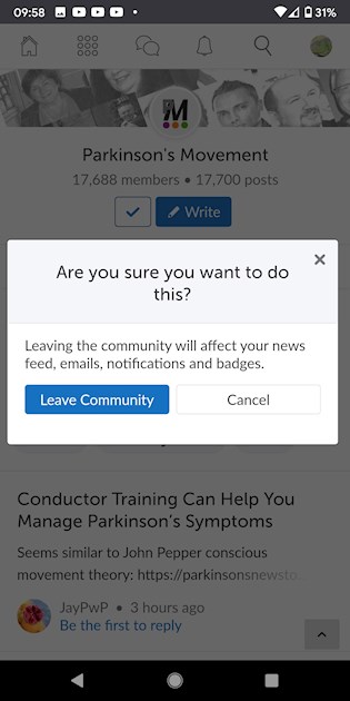
First it is not obvious that pressing a blue thick on a white button indicates you have chosen to leave the community. For such a decision, I think it should be in literal words like "leave the community". But if it has to be a symbol, why a blue thick?
Second, why place such a decision at the top centre of the front page? Why not place it at a navigable path under settings or somewhere else
At such a central place, people with shaky hands can mistakenly push themselves out. I for one, have mistakenly pressed the blue thick button a few times and was one shaky touch away from permanently pushing myself out
People should be able to leave if they want to but it shouldn't be at that place.
Or maybe it's me that is NOT up to date with current internet designs... IF SO SOMEONE PLEASE LET ME KNOW 😅