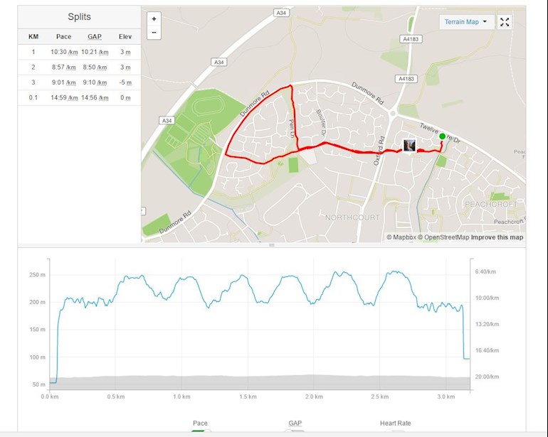
Since I'm a bit of a "data junkie" (work in analysis of medical data), I though it would be interesting to share the graph of pace against distance for Week 2 run 1, completed at 0745 this morning.
Step up from 60s to 90s wasn't too bad - first 90s run I was like "C'mon Jo when are you going to tell me to slow down", but the rest was fine.
Anyway I thought it made a pretty graph where you can see where I was running! There is a fair degree of data smoothing applied by Strava, it seems as I didn't gradually accelerate up to a peak and then gradually decelerate.
Written by
iain-strachan
Graduate
To view profiles and participate in discussions please or .
I like Strava for its data As you become more addicted to running - oops, sorry, become more interested, you may decide to buy a running watch. The data possibilities are immense
Content on HealthUnlocked does not replace the relationship between you and doctors or other healthcare professionals nor the advice you receive from them.
Never delay seeking advice or dialling emergency services because of something that you have read on HealthUnlocked.

") As you become more addicted to running - oops, sorry, become more interested, you may decide to buy a running watch. The data possibilities are immense
As you become more addicted to running - oops, sorry, become more interested, you may decide to buy a running watch. The data possibilities are immense