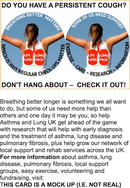
I did a recent post about the negative re-branding of A+LUK, with all it's talk of 'fighting' and the new 'sticking plaster' logo. I don't know how much all this cost, nor do I know whether other strap-lines and logos were considered, but I do know that just to moan is not enough, so here is a mock-up A6 landscape postcard* with a positive message.
Postcards are a cheap and flexible way to deliver 'messages' and information, plus they are easy to distribute and fit into pockets. A postcard should also be clear and of a simple design. I hope mine is this.
The letter sent to me 'From The desk of Sara Woolnough, CEO...' was set in a small font. used lots of underlining and was overwhelming. I'm sorry Sarah, I have yet to read it. I could say it's because I'm having a cataract operation on Saturday (which is true), but I know that lots of older A+LUK supporters like myself will struggle to read your letter.
My image is copyright free. I'm sure there are plenty out there who can do better than me and I say it is a mock-up quite clearly. - Robert Howard.
NOTE: * I get 4 x A6 postcards from a sheet of A4 size card or 2 x 4-sided A^ postcards. They are great for short-runs and almost all home printers can take 200 gsm card (I use 210gsm).
