Made this out of curiosity. Funny how it looks very different like this than in actual numbers and ranges. I am not medicated.
Just wanted to share this.
Made this out of curiosity. Funny how it looks very different like this than in actual numbers and ranges. I am not medicated.
Just wanted to share this.

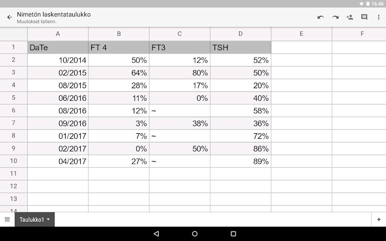
Interesting chart can you give some context in terms of what the % is of is it median of the range?
I suspect it is the percentage of the way through the reference range. So if I did some test or other - doesn't matter which one - and the result was 29 with a reference range of 21 - 37, then 29 is 50% of the way through the reference range.
If people use percentages it is easier to spot a bunch of tests which are low in range or high in range, and it is easier to spot trends.
Using percentages through the range also means you don't have to worry about a reference range changing. Just convert result to percentages and the change of reference range is irrelevant - you can still compare with previous or future tests.
Yeah that's what I did as I wanted to see the real trend which is hard just by comparing test results especially when you have had tests done in different labs.
The most amazing thing was to realise how inconsistent my results are and I can't find any point where I had felt nor my results were optimal or good. So it simply backs up the way you feel.
That is despite your having far more frequent tests than most of us. One test a year could fall on a good day or a bad day (for all sorts of reasons) - and that result sticks as representative of the whole year, and indicative of needs for the following year.
Your variability shows so very clearly that more frequent testing presents a different picture.
I posted another thread where biochemists are suggesting they control thyroid functin tests. What do they know of the patient?
I used this calculator chorobytarczycy.eu/kalkulator
Well worth creating a chart as well! The visual impact is significant - possibly both for you and any doctor who sees it.
Wow Justiina that is a very interesting way to chart your results. I think I will start doing the same, keep the chart on my phone and have it ready to show any doctor. (For myself I'd include a new column showing medication and doses too).
Thanks for this ingenuity!
Yup for someone medicated it works well as you can follow not just the numbers but record how you feel and have felt on different dosages. Being medicated gives you new biological set point once you find the sweet pot.
Just number in range was a bit hard to see in bigger picture but doing the chart shows what really happens between the numbers. Was eye opener for me!