I do make graphs not only of PSA but also of ALP, Albumin, Hb, Calcium, Platelets, NLR, PLR, LMR , CRP, LDH and so on. Graphs are very good tools as they allow us to catch trends early on.
As for the spikes after a new treatment, sudden death of lot of cancer cells causes release of bunch of PSA in the blood ...thereby showing increased PSA reading...only to fall to ground later on.
Ditto on the use of visual graphs a valuable tool to monitor your historical plots. I have been using an online serviced $97/year) called the Lab Test Analyzer labtestanalyzer.com/ which not only plots your blood lab data by simply uploading your PDF file of your blood lab work or manually if you wish. The website also explains each of your results and where it falls in the norms. Essentially, you can learn to interpret your own blood labs. That's how I started to understand what the heck my blood labs were all about.
"If you don't or can't measure it, you can't really manage it!" They also provide potential supplements that may/could help. Thus, you start to target your needs.
Finally, you can download your custom reports picking all of the data file or specific ones via the filter by category or body function. Very flexible. So, you can even take the reports and discuss with your doctor. That's what I do so I can ask much more intelligent questions.
They are usually more interested and respect you more when you have some idea what you are talking about. They always ask for a copy of my reports for their records as well.
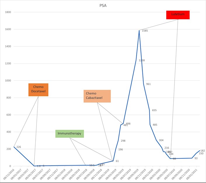
I have been tracking my PSA levels and treatments in an Excel sheet for almost 14 years. Excel can generate a very nice graph that is updated automatically when you add new data. Doesn’t cost anything if you have the Microsoft Office license already.
I track my numbers, from all blood tests. I finf it interesting to see a relationship in numbera, like when my glucose goes up a bit so does my alkaline phosphatase. May be unrelated but i keep seeing little things like that
This is my PSA ovr 13 years as tracked by my health records. You need to click on it to see all. The original rise in PSA was in 2008, prior to rad therapy, also the first mPC rise occurred in 2012. There were four rises before 2016 of up to about 10, followed by near vertical drops after treatments, and then a larger four-year "vacation" rise which rose to 35, and a drop to <0.1 last June, Each treatment was hormone therapy Lupron with bicalutimide and more recently with Xtandi. Generally each hormone treatment brought it down to <0.1. It was "intermittent" until this past June when I went to "continuous" every three months. Next month daily pill form.
My health records in Follow My Health (used by Sharp Healthcare) will present the data over time for anything regularly monitored like PSA and T. Perhaps other record trackers like MyChart would do the same.
Did you just do one round of the LU 177? It seems to have really worked for you. Any quality of life issues from it. By the way, I'm working on a chart like this for my husbands treatment....
Content on HealthUnlocked does not replace the relationship between you and doctors or other healthcare professionals nor the advice you receive from them.
Never delay seeking advice or dialling emergency services because of something that you have read on HealthUnlocked.